About the Brand
As the brand name suggests, ‘Let’s Whisk’ is a one stop destination for premium & healthy desserts of all kinds. Since a ‘whisk’ is one of the key tools used in baking, the logo design & brand name are directly inspired.
The brand is keen on bringing a new array of desserts in the city with authentic, natural and faithful values, therefore the use of kraft paper, black and white is part of the main branding.

Packaging & Brand Language
Continuing the brand’s visual language of kraft paper and a black and white colour palette, we incorporated it in Let’s Whisk’s packaging, menu and other design collaterals as well. Some of the minimalistic design collaterals showcased are the menu, thank you card, granola pouches, cupcake box and take away bags.


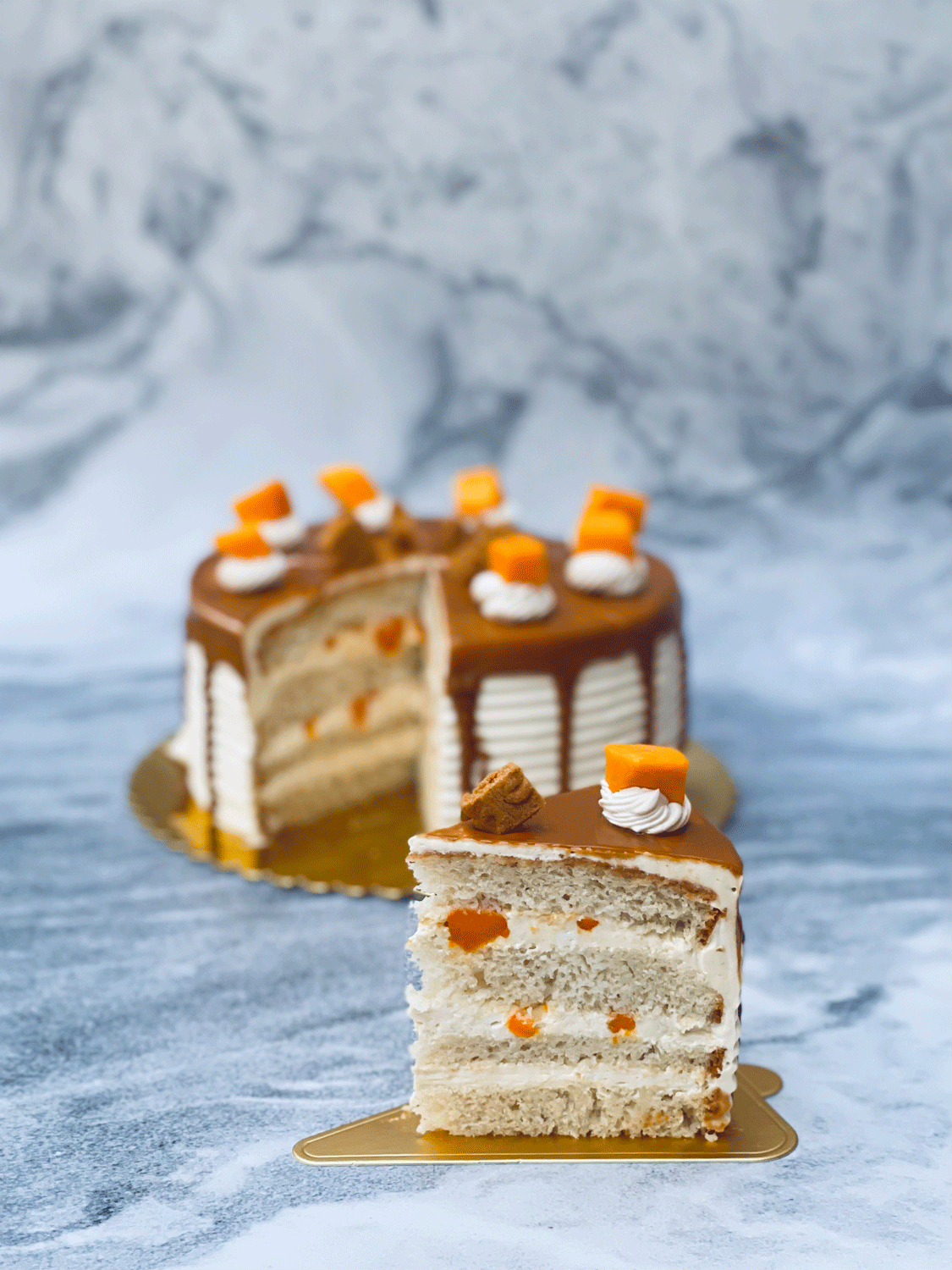
Social Media and Art Direction
An appealing social media appearance for food brands has always been a priority. Therefore, we put together great art direction, food styling with in-house photography and creative strategy in order to make the Instagram page with attractive layouts for Let’s Whisk’s delicious desserts to enterprise their growth.